ADMIN
Clarky 2: A Brand New Admin Experience
Clarky's admin has been redesigned from the ground up: a new sidebar navigation, a cleaner design language, refined dark mode, and a faster way to move between your inbox, CRM, calendar, and settings.
Read the docsSay hello to Clarky 2, the biggest visual upgrade in Clarky's history. Every admin screen has been rebuilt around a new sidebar shell and a calmer, more focused design language. Everything you already use is still here (nothing moved out from under you), it's just faster to reach and much nicer to look at.
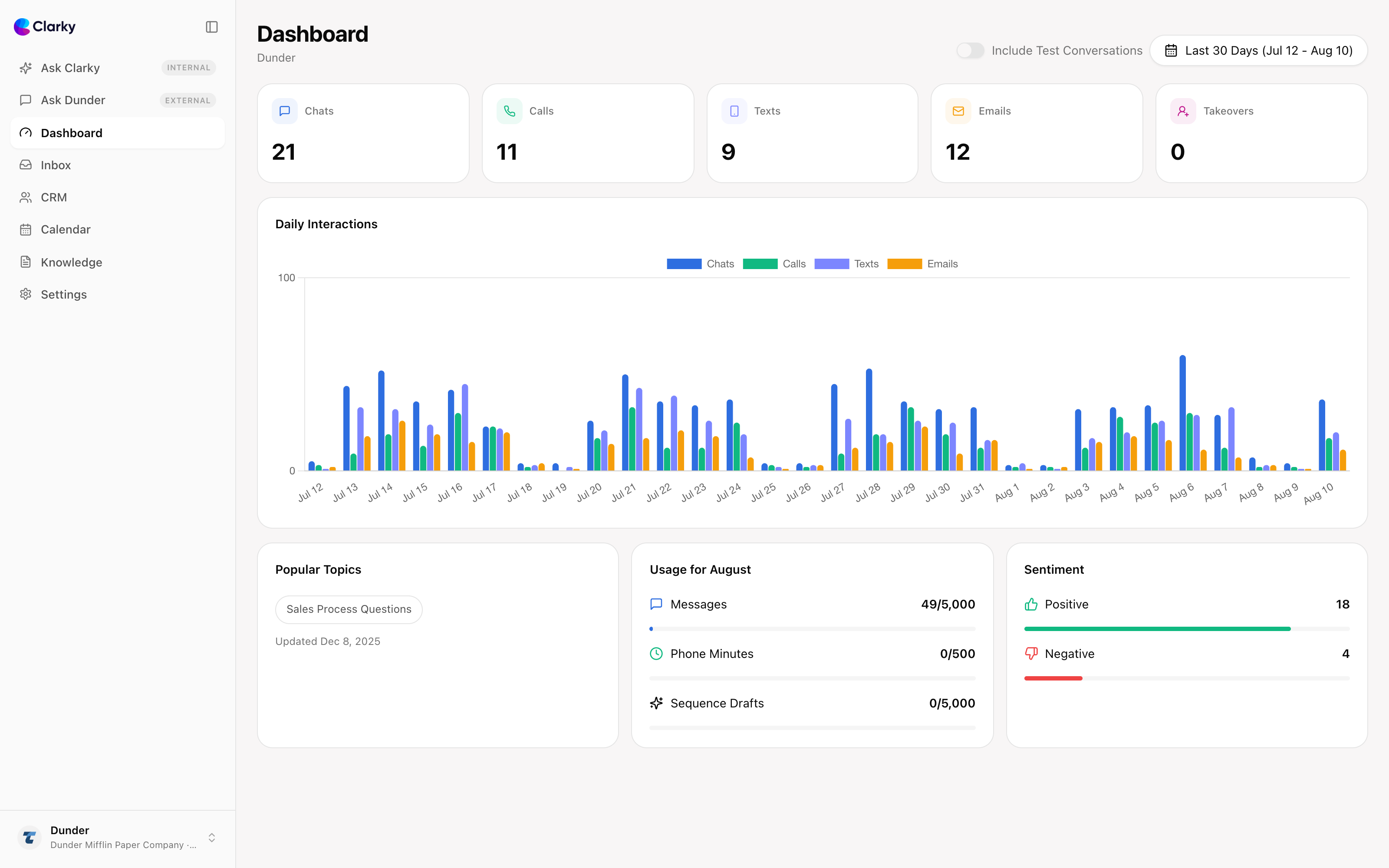
Key features include:
- Sidebar navigation: one persistent left sidebar puts Ask Clarky, your Dashboard, Inbox, CRM, Calendar, Knowledge, and Settings a single click away. Section pages like CRM and Booking show their sub-navigation right in the sidebar, so there are no more nested tab bars to dig through.
- A new design language: softer cards, pill-shaped buttons and filters, a purple brand accent, and a display typeface for screen titles give the whole admin a consistent, modern feel.
- Refined dark mode: every screen has been restyled for dark mode, with a theme switcher (light, dark, or system) built into the workspace menu.
- Better on mobile: the sidebar collapses into a clean mobile header with an overlay menu, so running your business from your phone feels natural.
- Ask Clarky front and center: your AI assistant now lives at the top of the sidebar with your recent chats one click away.
- Same features, zero relearning: this is a redesign, not a reshuffle. Every feature you rely on works the way it did before, in a faster shell.
Clarky 2 is live now for every workspace on every plan. Log in, take a lap around the new sidebar, and let us know what you think.